JustGiving / eCommerce checkout
The old process was clunky, cumbersome and impersonal in a world where giving means more than just handing over your money. The design of the user experience meant people weren’t completing the process so there was a high drop off rate meaning unhappy customers and donations not being processed.
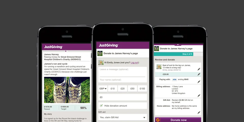
The idea of bringing the message people leave with donations forward to the start of the checkout process was formed after an inception period with key stakeholders across the business from customer service, to data and analytics to the CEO. The number of steps in the process were reduced to make it even easier for the user to checkout. Returning and logged in users are given the option to donate with one-touch, creating a frictionless experience!
Some key figures include an increase in registered users by 48% and increased mobile checkout conversion by 33%, desktop by 7%.
Fundraising page
Donation flow bringing the message to the start
Review and donate page

